Here in this post, we have shared 13 Matplotlib plots for Data Visualization widely used by Data Scientists or Data Analysts along with Python codes so that you can easily implement them side by side with us.
Python’s Matplotlib library plays an important role in visualizing and serve as an important part for an Exploratory Data Analysis step. There are different kinds of plots available with Matplotlib library like histograms, pie charts, scatter plots, line charts for time series, bar charts, box plots, violin plots, heatmap, pair plot etc. and all these plots you can create easily with just a few lines of code.
Reason and Importance of Matplotlib Plots for Data Visualization
We have previously shared the importance of Visual Exploratory Data Analysis using Matplotlib library in one of our posts using Anscombe’s Quartet Dataset which clearly showed that depending only on summary statistics can be troublesome and how badly it can affect our machine learning model.
Basically, there are two important rules that one must follow while plotting the charts:
Data-Ink Ratio: This term is coined by Edward Tufte and is defined as the amount of ink used to describe the data to the amount of ink used to describe everything else. Basically, in simple words, this term defines the principal – Less is more effective and attractive. You can check the Wikipedia article for more information here.
 Lie Factor: This term is also coined by Edward Tufte and the idea behind lie factor is to express in numbers, how much a graphic deviates from the actual data it should represent. The formula for calculating the lie factor is:

A good rule of thumb to remember: Truthful charts always have a lie factor of one, whereas any lie factor greater than one suggests that your visual is misleading. You can check about Lie Factor on Wikipedia from here.
There are other rules as well which we have not covered in this post, you can find those here.
Types of Matplotlib Plots for Data Visualization in Data Science:
- Scatter Plot
- Histograms
- Stacked Histogram
- Multiple Histogram
- Stacked Step Histogram
- Line Charts
- Strip Plot
- Swarm Plot
- Violin Plot
- Joint Plot
- Pair Plots
- Heat Maps
- Bar Chart
- Multiple Bar graph
- Stacked Bar Graph
- Pie Chart
- Stem Plots
- Box Plots
Let’s take one by one all the above Seaborn or Matplotlib plots for Data Visualization in Data Science and also see the python codes we used to create those plots. For few plots we have used Boston Housing dataset which you can download from here.
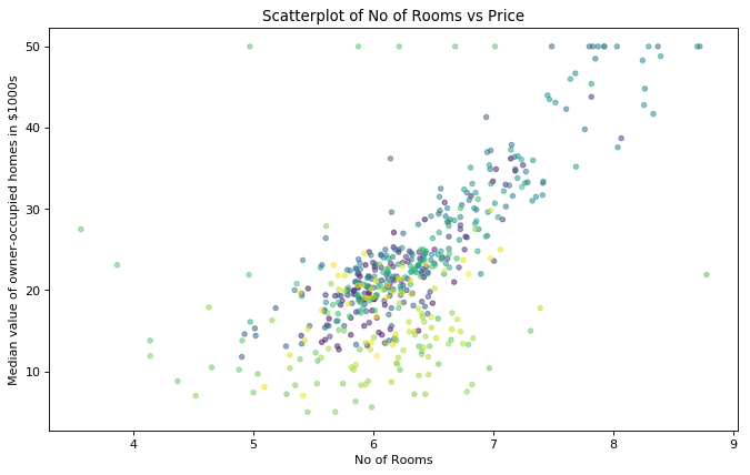
Scatter Plot – Generally scatter plot is a graph in which the values of two variables are plotted along two axes, the pattern of the resulting points revealing any relationship or correlation present between both the variables. As you can see below, a scatter plot between Number of rooms and Median value of owner-occupied homes and from that, we can clearly see that both are positively correlated with each other. Here’s a code below which you can use to plot a scatter plot:
data = pd.read_csv("C:\\Users\\Pankaj\\Desktop\\Dataset\\Boston_housing.csv", index_col=0)
x = data["rm"]
y = data["medv"]
colors= range(data["rm"].count())
plt.figure(figsize=(10, 6), dpi= 80, facecolor='w', edgecolor='k')
plt.scatter(x, y, s=15, c=colors, alpha=0.5)
plt.xlabel("No of Rooms")
plt.ylabel("Median value of owner-occupied homes in $1000s")
plt.title("Scatterplot of No of Rooms vs Price")
plt.show()

For more information like other optional parameters, you can define with plt.scatter(), check here.
Histograms – A histogram is a type of graph which helps us to show the normal distribution of a continuous variable. It looks like a bar graph but it differs, in the sense that a bar graph relates two variables, but a histogram relates only one. Here’s how you can plot a histogram:
N_points = 1000
n_bins = 40
# Generate a normal distribution, center at x=0 and y=5
x = np.random.randn(N_points)
# We can set the number of bins with the `bins` kwarg
plt.hist(x, bins=n_bins)
plt.show()
 To know how to create other types of histograms, click on the respective links – Stacked Histogram, Multiple Histogram and Stacked Step Histogram.
Line Charts – Generally Line Charts are used to show and analyse data over a time. Line charts are sometimes called a Time Series charts as well. In general, any chart that shows a trend over a time is a Time series chart and usually its a line chart that we use to see time series data.
To know how you can create line charts, you can check out our post, Creating Time Series with Line Charts using Python.
Strip Plot – A strip plot draws a value on a number line to visualize samples of a single random variable. Here’s below a code to plot the strip plot:
sns.stripplot(y="medv", data=data)
plt.show()

We can also show the stip plot group by the “rad”, which is an index of accessibility to radial highways. variable. Here’s a code:
sns.stripplot(x="rad", y="medv", data=data)
plt.show()

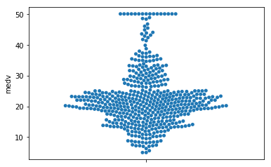
Swarm Plot – Using Swarm plot we can draw a categorical scatterplot with non-overlapping points i.e. this type of plot automatically arrange points representing repetitive values to avoid overlapping. If you compare below swarm plot with the above strip plot you can easily understand its functioning and usability.
Here’s below a code to create a swarm plot:
sns.swarmplot(y="medv", data=data)
plt.show()

For more information like other optional parameters, you can define with sns.swarmplot(), check here.
Violin Plot and Box Plot – When there is a lot of data, both strip plot and swarm plot are not ideal in those instances, we can plot a violin plot or a Box Plot. The basic idea of violin plot is that distribution is denser where the violin plot is thicker. When it comes to Box Plots, they are kind of illustration of ranges, maximum, minimum and median values of a dataset along with Ist and IInd quartiles and Outliers.
Here’s a code to plot violin plot and box plot:
plt.figure(figsize=(10, 6), dpi= 80, facecolor='w', edgecolor='k')
plt.subplot(2,1,1)
sns.boxplot(x="rad", y="medv", data=data)
plt.ylabel("Median value in $1000s")
plt.figure(figsize=(10, 6), dpi= 80, facecolor='w', edgecolor='k')
plt.subplot(2,1,2)
sns.violinplot(x="rad", y="medv", data=data)
plt.ylabel("Median value in $1000s")
plt.tight_layout()
plt.show()
Below is a Box plot graph and Violin Plot graph respectively.

Joint Plots – Joint Plots are different from other plots in a way that these plots will show the relationship or correlation between the two variables along with histograms if the individual coordinates. Have a look at the code and plot below to understand better.
x = data["rm"]
y = data["medv"]
sns.jointplot(x=x, y=y, data=data, kind='scatter')
plt.show()

Pair Plots – Most of the times we have more than 2 variables in our dataset and we want to plot all possible joint plots for each pair of variables. This is where pair plots find its importance. The important point to note here is that pair plot automatically considers only numerical columns and the remaining columns were intelligently ignored. Have a look at the code and plot below to understand better.
sns.pairplot(data)
plt.show()

Bar Chart – We can use a bar graph to compare numeric values or data of different groups or we can say that a bar chart is a type of a chart or graph that can visualize categorical data with rectangular bars and can be easily plotted on a vertical or horizontal axis. Here below a bar chart is shown with a code:
Movie_Name = ('Iron Man', 'Avenger', 'Captain America', 'Ant Man', 'Thor', 'Bat Man')
index = np.arange(len(Movie_Name))
Rating = [9,8,7,7,8,9]
plt.bar(index, Rating, align='center', alpha=0.5)
plt.xticks(index, Movie_Name, rotation=30)
plt.ylabel('Rating')
plt.title('Movie Rating')
plt.show()

To know how to create other types of Bar Chart, click on the respective links – Stacked Bar Graph and Multiple Bar Graph.
Heatmaps – To check the correlation between all the features present in a dataset, we use Heatmaps. The correlation between all the feature variable and target variable by plotting the heat map as shown below:
sns.set(rc={'figure.figsize':(11.7,8.27)})
sns.heatmap(data.corr().round(2), square=True, cmap='RdYlGn', annot=True)

From the above plot, we can easily say that feature “rm” and target variable “medv” are highly correlated.
Stem Plots – Stem Plots is a type of plot that shows how individual values are distributed within a set of data. Also, a stem plot plots vertical lines at each x location from the baseline to y and places a marker there. Below is how you can plot a stem plot:
y = np.linspace(0, 2* np.pi,10);
plt.stem(np.cos(y),'-.');
plt.show()

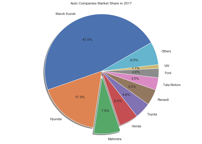
Pie Charts – Pie Charts help show proportions and percentages between categories, by dividing a circle into proportional segments. Each proportions combine to form a total proportion, generally a shown below we have shared the market share by Automobile companies in 2017. Here we have shared market share percentage of respective companies and combinely all makes 100%.
labels = 'Maruti Suzuki', 'Hyundai', 'Mahindra', 'Honda', 'Toyota', 'Renault', 'Tata Motors', 'Ford', 'VW', 'Others'
sizes = [47, 17.3, 7.5, 5.4, 4.6, 4.5, 3.5, 2.6, 1.1, 6.5]
explode = (0, 0, 0.1, 0,0,0,0,0,0,0)  # only "explode" the 2nd slice (i.e. 'Hogs')
fig1, ax1 = plt.subplots()
ax1.pie(sizes, explode=explode, labels=labels, autopct='%1.1f%%',
        shadow=True, startangle=30)
ax1.axis('equal')  # Equal aspect ratio ensures that pie is drawn as a circle.
plt.title("Auto Companies Market Share in 2017")
plt.show()

These all plots that we shared in this post are most used Matplotlib plots for data visualization in Data Science. Hope you like this post. If you need any help, please post in comments, i will be happy to help you.
Leave a Reply